Promote the Olympic Games in London: The Logo and the Mascots
The Logo
Created by Wolff Olins, was made public June 4, 2007 and was to cost £ 400,000.
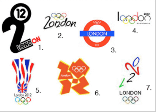
The logo is a representation of the number 2012, with the Olympic rings placed in 0. The word "London" appears on 2 of "2012 ". This is the first time the same logo is used for the Olympic Games and Paralympic Games. There is also the first time in Olympic history that a logo is displayed in different colors. The logo of the Paralympic Games, shows a variety of colors, including magenta, purple, orange and green. The last four, of different versions of the official logo, however, are light blue, orange, green and magenta.
If the logo of Beijing is played on soft forms, red and decided a symbol that expresses the concepts of easy interpretation of the 2012 London Olympics logo consists of a set of geometric shapes, the colors are not fixed (there are several versions, all with bright colors) and the beginning is not easy to understand what it represents.
At first sight is a crock of shapes, is the "2012" and the stylized acid colors (not fixed, they change in several variations as is so fashionable now) recalls the dynamics of the Olympics and the freshness of sport , but in reality as more and more often the case is yet another mark Olympics failed, according to many people.
The criticism most often by professionals in the field are: lack of representation of the basic values, multi color, if in small dimension the Olympic rings and "London" disappear. All important basic concepts for designing a great logo that should never be overlooked, especially for sporting events worldwide.
According to much of British public opinion on the proposed logo for the 2012 Olympics is simply "repulsive. " The video version has even been withdrawn after an institution for epilepsy patients reported 12 cases of collapsing at the sight of the animated logo.
In less than two days in the 2007, almost 50 thousand people have joined the online petition "Change The London 2012. " The British tabloid "Daily Mail" has gone even further, calling the design fruit "of the work of a chimpanzee. " A "broken swastika", "one doodle" or the "symbol of the SS" to the opinion, however, many Internet users. Sure, there are those who launched the counter-petition in support of the logo, so regardless of the outcome.
The health aspect is by no means be underestimated. "That logo is not safe for people with photosensitive epilepsy - said Epilepsy Action spokeswoman Ingrid Burns -. Within hours of its launch we recorded 12 cases of collapse. Especially the younger ones, the main recipients of the promotional campaign , to be at risk. "This is why the IOC has done immediately to withdraw the image from their official website. But according to Professor Graham Harding, a neuropsychologist, the clip should not even be shown on television because the screen size of more modern color TV could increase the risk.
Is interesting to read in a survey about the choice of the logo, the opinion of the people: nobody prefer the actual logo.
Olympic Games in London: Logo

London's 2012 Olympic pictograms instead, seem to have been accepted in a positive way. The design is the work of the London studio Someone. Were created for the first time, two series of pictograms.
The first is more static, the classic pictogram "information-signaling" high visibility and readability.
The second set is much more dynamic, decorative, emotional, and incorporates the corporate colors of the event (one of the few to save the logo above), and creates a visual identity system that I think is not used very only the organization but also from the many licensees that revolve around such events.
The masctos
Their shapes were made with steel compound used for the last beam of the Olympic Stadium: Wenlock and Mandeville are the official mascots of the 2012 London Olympics. They have only one eye, and at first impression, do not seem particularly funny or cute, but according to the organizers great success among children.
The President has made the Olympic Committee, Sebastian Coe, who explained that the inspiration was a "love story" written by the author Michael Morpurgo children.
They are also protagonists of many video cartoon created for the event.
Continua a leggere:
- Successivo: Promote the Olympic Games in London: Innovations for the event
- Precedente: Promote the Olympic Games in London: Television
Dettagli appunto:
-
Autore:
Lorenzo Blangiardi
[Visita la sua tesi: "L'informazione spettacolarizzata"]
[Visita la sua tesi: "Il video interattivo come strumento per una didattica rinnovata"]
[Visita la sua tesi: "L'assistente sanitario e la comunicazione nei programmi di prevenzione secondaria"]
- Università: Università degli Studi di Firenze
- Facoltà: Scienze dell'Educazione
- Esame: Inglese
- Docente: Solly
Altri appunti correlati:
- Cultura Letteraria e Sistema dei Media
- Marketing nell’industria del turismo e dell’accoglienza
- Marketing per gli eventi culturali
- Nuovi orizzonti della pubblicità
- Il nuovo manuale di tecniche pubblicitarie. Il senso e il valore della pubblicità
Per approfondire questo argomento, consulta le Tesi:
- L'influenza percepita di Tik Tok nel processo di acquisto della Generazione Z
- Branded Content e Branded Entertainment. La marca come Media Company.
- Tecnologie alternative o alternative alla tecnologia? La disconnessione come valore e strategia di marketing
- Turismo e Web 2.0. L’influenza dei Social Network sugli eventi turistici culturali: il caso studio “Tempus est Jocundum” di Gemona del Friuli
- Il ruolo del Web Marketing nelle strategie di internazionalizzazione delle imprese agroalimentari italiane
Puoi scaricare gratuitamente questo appunto in versione integrale.

